A word from the client:
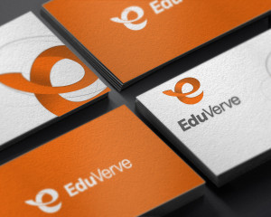
“I love it!!! First reaction is that I am blown away by it its so beautiful. I can also look at it differently and then the ‘e’ suddenly looks funny, but on feel (looking with the heart) and glance – brilliant. Love the orange and vibrancy. Love how it looks in white on orange and grey on grey. Love the happy ‘e’ – reminds me of the ‘happy e’-s in the Heineken logo. Love the associations and the italics. It will even help me run my business somehow!!”
Client:
EduVerve
Sydney NSW, AU

